
Colors have a powerful impact on the human mind, affecting moods and emotions. They can stimulate appetite, induce calmness, or offer a refreshing boost.
With marketing and branding, this concept takes shape as color psychology–the strategic utilization of colors to elicit specific effects. Remarkably, color psychology can sway the purchasing decisions of as many as 85% of customers, underscoring its pivotal role in advertising. Beyond mere aesthetics, it digs into the complex range of human emotions, revealing how brand colors can resonate with and influence consumers.
Let’s discover how businesses can harness the power of color psychology to enhance their brand identity in advertising.
Understanding Color Psychology
Color psychology explores the relationship between colors, emotions, and behaviors. Its ancient origins can be traced to Egypt, China, and Greece. Modern understanding of colors emerged through scientific breakthroughs, such as Isaac Newton’s discovery of the color spectrum, Johann Wolfgang von Goethe’s work on colors and emotions, and K. Goldstein’s research on colors and human physiology and behavior.
Today, color psychology impacts various aspects of our daily lives, including advertising and marketing, branding, product design, and even the layout of work, school, and living spaces.
Connecting Color Psychology With Brand Identity in Advertising
The power of color significantly shapes a consumer’s initial impression of a brand or product. The emotions and associations tied to specific colors, such as the perception of luxury with black, can heavily influence their views of the product and, consequently, the brand.
Color psychology plays a crucial role in consumer decision-making and brand assessment. Consider these compelling insights:
Research from the University of Winnipeg:
- The logo color is frequently the primary element that captures a customer’s attention.
- An impressive 60% of consumers base their acceptance or rejection of a product on its color.
- Color advertisements outperform their black and white counterparts, garnering 42% more attention.
Statistics from Review42:
- Incorporating colors can boost brand awareness by a remarkable 80%.
- Colors have a discernible impact on people’s behavior, emotional states, and stress levels.
- An astonishing 93% of shoppers prioritize the visual aspect when contemplating a purchase.
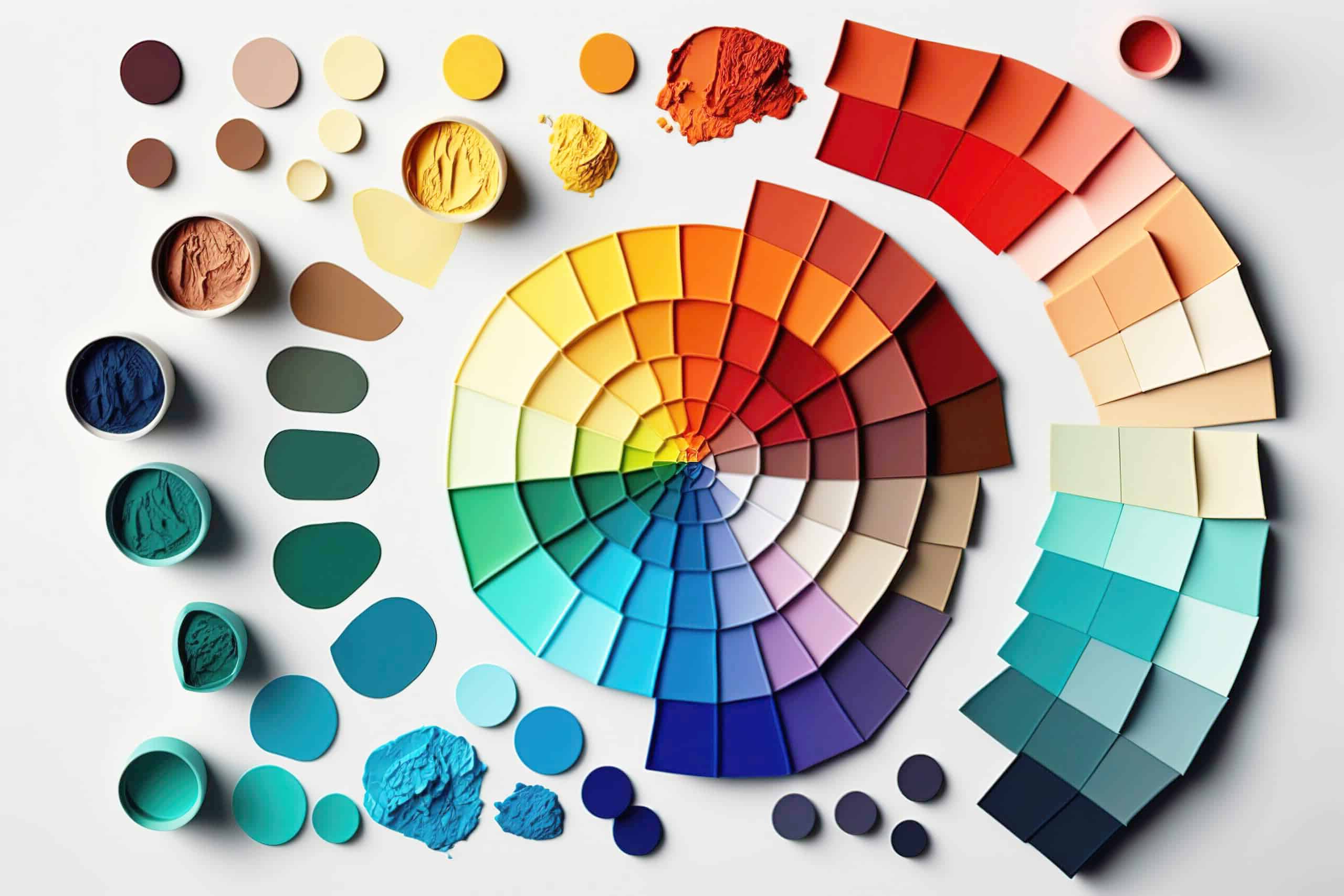
Breaking Down Colors in Psychology
- Red
Red is an attention-grabbing color that can evoke excitement, passion, and love. It’s often used in calls to action, like “order now” buttons, to attract attention. While red can incite strong emotions, it’s important to use it sparingly due to its intense nature. Brands such as YouTube and Coca-Cola employ red in their logos.
- Blue
The world’s favorite color is known for its calming and trustworthy attributes. Blue is used in logos for data-driven brands like Facebook and Twitter due to its connotations of security and wisdom, but it can also evoke a sense of coldness and suppress appetite.
- Green
Symbolizing nature, green has a positive impact on cognitive processes. It is associated with growth and prosperity, making it a suitable choice for health and fitness brands. Brands like John Deere utilize green, particularly when focusing on natural elements or agriculture. Money-related businesses may also use green to attract customers interested in financial growth. - Yellow
Yellow is a cheerful color that can trigger both positive and negative emotions. It radiates cheerfulness, but too much of it can cause anger, frustration, fear, and anxiety. Its stimulating qualities are used in traffic signs, advertisements, and warning labels. Yellow can also boost metabolism and self-esteem when used strategically.
- Purple
A balance between red’s warmth and blue’s coolness, purple conveys luxury, sophistication, and spirituality. Depending on their underlying hues, the varying shades of purple can indicate warmth or coolness. Purple is associated with creativity, imagination, and contemplation. - Orange
Orange is a confident, creative, and warm color that works well for non-corporate brands. It evokes a sense of fun and creativity but can also generate feelings of frustration and immaturity. Nickelodeon uses orange to match their quirky branding and whacky programming.
- Black
Black is a color that exudes sophistication and power, commonly used in luxury brands like Chanel. However, it can also come across as oppressive and cold and is sometimes associated with evil. It’s rarely used in the health industry due to its association with death and mourning.
- White
White is often associated with purity and cleanliness, making it suitable for healthcare branding. Brands like Apple use it to denote modernity and chic design. However, overusing it can evoke coldness, emptiness, and isolation.
Selecting the Right Color for Your Brand
- Pick an Authentic Brand-Related Color
Choosing a color that aligns with your brand’s essence and personality is crucial, especially in certain industries where incongruence can turn away potential customers.
- Opt for a Color That Embodies Your Brand Personality
A well-defined brand personality expands beyond colors, integrating fonts, visuals, and more. Color is a visceral method to convey your brand’s personality and connect with customers emotionally.
- Choose a Color Tailored to Your Target Audience
Understanding your audience is critical for branding, especially when choosing the right brand color. Customer research helps build a buyer persona that represents your typical customer. Then you can ensure that your brand identity resonates with your customers.
- Analyze Your Competitors’ Brand Colors
Evaluate your competitors’ brand colors and use unique colors to stand out. Understanding why your rivals chose their specific colors can help you make strategic branding decisions that differentiate your product. Try not to just follow the pack, but find ways to be unique.
- Execute Brand Colors Consistently
Consistency is key for effective branding. Applying colors consistently amplifies their impact. Inconsistent use of colors undermines brand equity. Make sure to create a solid brand style guide that dictates proper use of the brand colors.
Build Your Brand’s Color Palette With Atomic Idea
Choosing colors for your brand requires authenticity, audience appeal, and an understanding of your competition. By recognizing color’s impact on perception and emotion, businesses can create brand identities that resonate with their target audience.
At Atomic Idea, we’re committed to becoming a premier branding service provider in Colorado by prioritizing active listening. We believe in the significance of understanding your unique vision, helping us craft and fine-tune your brand strategy across all platforms, including selecting the perfect color palette for your logo, collateral, and website.
Reach out to us today to embark on this transformative journey!